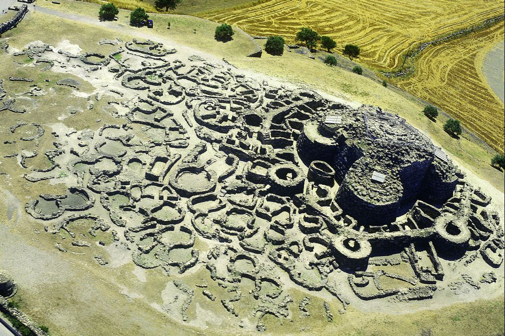
One of the first act of the new born Faculty of Architecture, Cagliari University, in 2005, was to create the corporate identity. Logo, stationary, a number of other communication tools were inspired by the shape of the nuraghic village – the most ancient and singular expression of Sardinian architecture, since 2500 b.C. – together with the Cagliari capital C. Some days ago, a collegue of mine show me a work by Paul Rand I didn’t know, the Columbus Indiana Visitor Center. What a shock, but what a good shock…
Category: 2004
officine metal-meccaniche italia
carbonia landscape machine
Carbonia was founded in 1938 near Italy’s largest coal mine. After a decline lasting more than 40 years, the city is now a monument to civil and industrial modernist architecture. The identity design goes from the logo (seven white dots that glow in the dark like miners’ lanterns) to museum exhibition design, paper products, videos, jingles, street furniture, merchandising. In the following pages: 1. logo, 2. poster, 3. 2x2x4 m Corten steel totem and 4. folding brochure for the open air modern architecture museum. The font used for the titles was specially designed by Stefano Asili. The Carbonia project won the Council of Europe 2010-11 Landscape Award.