new typocarpets

gianni alessandraHere are three new projects for my typographic carpets. One, monochrome, was created, as always by Mariantonia Urru, for Gianni and Alessandra. The second was composed in two different versions, one monochromatic and the other in color, for a family composed of Marco and Laura, the parents, and Daniela and Elisa, their daughters. The larger version is a family rug, divided into three equal bands. I would like that, when Elisa and Daniela will fly from the nest, the carpet can be divided into three narrower bands (although perhaps it could be technically complex), each of which brings with it however all the information of the family, like a DNA.

a) marco laura elisa daniela 2

[ Ecco tre nuovi mie progetti di tappeti tipografici. Uno, monocromatico, è stato realizzato, come sempre da Mariantonia Urru, per Gianni e Alessandra.
Il secondo è stato composto in due versioni diverse, una monocromatica e l’altra a colori, per una famiglia composta da Marco e Laura, i genitori, e Daniela ed Elisa, le loro figlie. La versione più grande è un tappeto di famiglia, diviso in tre fasce uguali. Mi piacerebbe che, quando Elisa e Daniela voleranno dal nido, il tappeto possa essere diviso in tre fasce più stretti (anche se forse potrebbe essere tecnicamente complesso), ognuna delle quali porti dietro però tutta l’informazione della famiglia, come un DNA. ]

IMG_3799

typocarpet at biennale architettura venezia 2018

33901222_952874041550552_4279793880917868544_otelaio 70 mu cucinella biennale def

Some month ago I was asked to design a carpet for the Italian Pavillion at Biennale Architettura 2018, Venice. It is a part of a project of five selected by Mario Cucinella, the italian curator for the present edition. Here you can see the realized carpet (by Mariantonia Urru) and the project, showing the title “Arcipelago Italia”, in colour, and “Biennale Venezia” in black letters.

[ Alcuni mesi fa mi è stato chiesto di progettare un tappeto per il Padiglione Italia alla Biennale Architettura di Venezia 2018. Eccolo: è parte di uno dei cinque progetti selezionati da Mario Cucinella, il curatore del padiglione. Qui si può vedere il tappeto realizzato (da Mariantonia Urru) e il progetto, nel quale sono leggibili le scritte “Arcipelago Italia”, colorata, e Biennale Venezia, in nero. ]


non potho reposare

This is my first typographic carpet to be a standard product. It is based on the first words of the most beautiful Sardinian love song, “Non potho reposare”, (I can’t sleep) which are easily readable in the diagram below. As always it is produced by Mariantonia Urru, a craftsman’s workshop that this year won the Best Interior Award at the Domotex 2018 in Hannover. This carpet can be read and sung: the plot that accompanies the letters is the score – in square, almost Gregorian notation – of the melody.

[ Questo è il mio primo tappeto tipografico di serie. È basato sui primi versi della più bella canzone d’amore sarda, “Non potho reposare”, che sono facilmente leggibili nello schema in basso. Come sempre è prodotto da Mariantonia Urru, un laboratorio artigiano che quest’anno ha vinto ad Hannover il Best Interior Award a Domotex 2018. Questo tappeto si può leggere e anche cantare: il motivo che accompagna le lettere è infatti lo spartito – in notazione quadrata, quasi gregoriana – della melodia della canzone. ]

IMG_9128non potho telaio 320X200 evid rossoIMG_9116bIMG_9114r

prototypes: customizable, handmade, sardinian typographic rugs

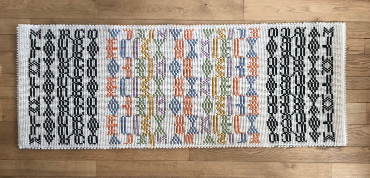
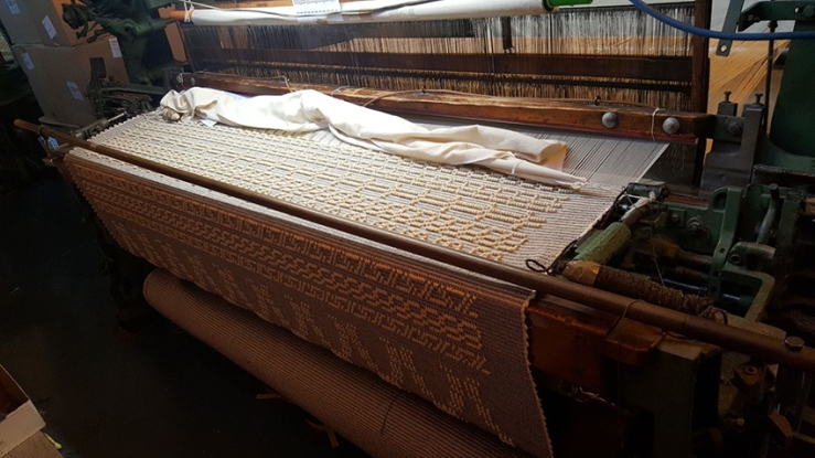
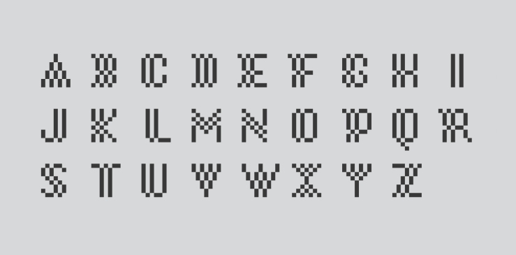
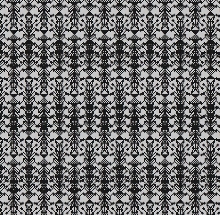
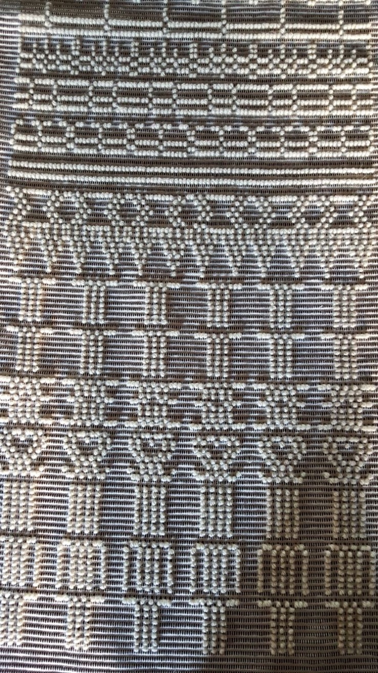
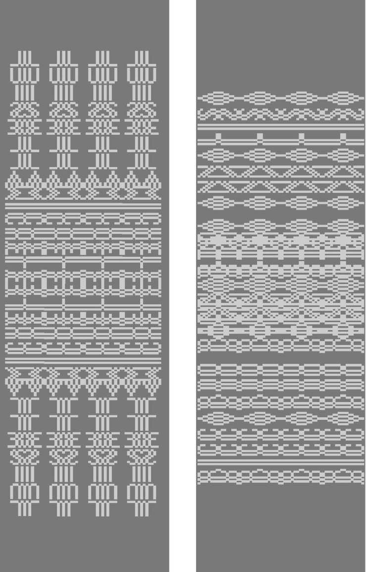
Here it is, finally: my first typographic rugs. It is the completion of a research work of years, as evidenced by the pages of this site. The experimental test, the proptotype. I have baptized them with “Tavoletti” because they have something to pay to Eugenio Tavolara and Alighiero Boetti (and because of the sardinian term “tauleddas”, tavolette in italian, which designates the small Sardinian tapestries). They maintain the geometric rigor, the recursive counterpoint typical of the Sardinian textile tradition, but add to the typographical element, which introduces a further level of reading, surprise and customization. They are the product of an algebra in which element matrices are subjected to inversion, rotation, symmetry, overlay, etc. to form the ornament. A graphic that can be used in its serial abstraction and, at the same time, a typography that can be read and understood.

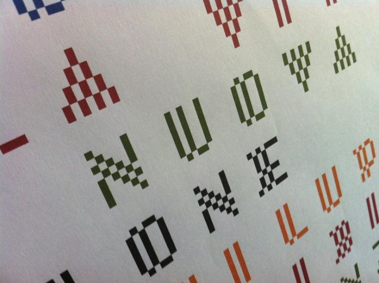
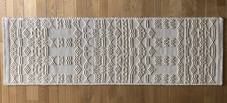
They were made by Maria Antonia Urru for two couples, Luisella and Michele, Riccardo and Annalisa (highlighted in yellow and magenta in the third picture), to whom they were given by my friend architect Marco Tradori, who commissioned me. In the first one, Luisella / Michele, the composition is perfectly symmetrical, on two orthogonal axes. In the second, Annalisa / Riccardo, there is also an overlapping of the two names, which generates new geometric motifs. For the moment they are almost monochromatic, but the next (which will be realized shortly) will play with colors and size scale.

[ Eccoli, finalmente: i miei primi tappeti tipografici. È il coronamento di un lavoro di ricerca di anni, testimoniato dalle pagine di questo sito. Il prototipo e l’evidenza sperimentale. Li ho battezzati Tavoletti, perché devono qualcosa sia a Eugenio Tavolara che ad Alighiero Boetti (e per assonanza con il termine “tauleddas”, tavolette, che designa i piccoli arazzi sardi). Mantengono il rigore geometrico, il contrappunto ricorsivo tipico della tradizione tessile della Sardegna, ma aggiungono l’elemento tipografico, che introduce un ulteriore livello di lettura, sorpresa e personalizzazione. Sono il prodotto di un’algebra in cui le matrici degli elementi vengono sottoposte a processi di inversione, rotazione, simmetria, sovrapposizione, etc. che vanno a formare l’ornamento. Una grafica fruibile nella sua astrazione seriale e, allo stesso tempo, una tipografia che può essere compresa e letta.

Sono stati realizzati da Maria Antonia Urru per due coppie, Luisella e Michele (evidenziati nella terza immagine), Riccardo e Annalisa, a cui sono stati regalati dall’amico architetto Marco Tradori, che me li ha commissionati. Nel primo la composizione è perfettamente simmetrica, su due assi. Nella seconda c’è anche una fascia di sovrapposizione dei due nomi, che genera nuovi motivi geometrici. Per il momento sono quasi monocromatici, ma i prossimi (che verranno realizzati a breve) giocheranno con i colori e con i passaggi di scala. ]
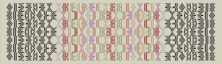
luisella micheleannalisa michele 2evid arazzo tipografico luisella michele 1riccardo annalisariccardo annalisa 2riccardo annalisa PER TELAIO c


sardinia pavillion at expo 2015 milan

During the Expo Milano 2015, two groups from DADU Alghero (coordinated by Nicolò Ceccarelli, with Marco Sironi and Attilio Baghino) and DICAAR Cagliari (coordinated by me) have developed the exhibit design of the Autonomous Region of Sardinia pavilion during the week dedicated to the island. We meet very strong constraints: everything had to be assembled and dismantled in six hours, had to be reusable, must coexist with many fixed and unchangeable parts. Sardinia Dingbats are used in a stencil version for a specially designed shelter entrance, for backlight walls and to drill stools, inside which essences were inserted. On the walls, a horizontal slot contained a smelling Helichrysum. The rectangular module guided the conceptualization of the sea, through a suspended installation inspired by Calder’s mobiles. The central video wall formed colorful tapestries, animated by the group of Alghero, who also created the movies and the music that flowed on the monitors. Daniela Ducato contributed with textural natural panels, used as artworks on the walls. A golden female note was added by Cristiana Collu, which included hundreds of elegantly serial cowbells. During the inauguration, Roberto Petza has proposed again the food carpet with great success.

interno expo 2mare-calder-expoda-corridoio-expointerni-exposedute expoinaug-expo-genteinaug-expo

new sardinian fonts

In the summer of 2015, the Autonomous Region of Sardinia asked two groups from the Departments of Architecture of the Universities of Sassari and Cagliari – the first one coordinated by Nicolò Ceccarelli, the second by me – to develop a new visual identity of the island for Expo Milano 2015. This identity will become the visual spine of the communication strategy of Sardinia in the coming years. First I designed a set of typefaces with a strong local identity. I called them Bàttoro (after the name of the traditional weaving from which they take inspiration) and PB1 (as pibione, the Sardinian word for the weaving dot). The equation pixel = pibione established the modular and serial way of the graphic research. The created fonts are decorative, good for headlines and logos or, like you can see, ricursive and intertwining patterns. It’s another way to get interesting typographic textures. Here is shown the claim “Sardegna isola senza fine” (Sardinia endless island), that I created as well. For longer texts, which need to be red without any difficulties, we used the Open Sans. In addition to the first two sets, I wanted a set of dingbats made up of figures of traditional Sardinian weaving, plus some new and imaginative, specifically designed. With my team of collaborators (Matteo Buccoli, Francesca Oggiano, Claudio Rossi), we designed a set of figures called Sardinia Dingbats, with which you can process virtual tapestries typing on the keyboard. The serialization of the compositions follows a way I had already studied for the typographical tapestries and these typefaces give to designers and craftsmen a powerful tool for creating ever new combinations.

battoro bisacciabattoro su grigio4sardinia dingbats per expoarazzi-typo-sardegna-14battoro-per-exposardinia-dingbatsIMG_2374 bpattern sardinia dingbats 2pattern sardinia dingbats 1pattern sardinia dingbats 3pattern sardinia dingbats 4

sardinian carpet for a dentist

I designed this carpet for a friend, a very good dentist specialized in correcting the smile of children. It was handmade by weaving cooperative Su Trobasciu in Mogoro. My friend’s family has always been involved in the distribution and marketing of catch. The carpet is a kind of family coat of arms: fish bones are recognizable, while teeth have a more abstract shape (upper and lower dental arches are spread out), either in the “free” form and with the corrective coloured brace.

tappeto-farci-esecutivo-2tappeto farci 1tappeto farci 2tappeto farci 3

orgosolo sarong for joias

For Joias I designed a sarong that revisits the traditional costume of Orgosolo. A transposition of the strong iconic tradition of inner areas of Sardinia on a typical garment of the beaches. A way to communicate identity to different and wide people, who spent their summer holidays on the Sardinian coast. Easy to carry and to pack, it can speak about our island beyond the sea of Sardinia.

orgosolo per joiasDSC_9712-e1434040385729-400x600DSC_9459 rid

typographic sardinian rugs

The ZX Spectrum pixel font never ends to give me satisfaction. I had already used to call the weaving in some work of recent years. Since then I’ve been working to design sardinian traditional tapestries and rugs using typography. I show the last one, dedicated to the great Roberto Petza, chef of the “star” restaurant S’Apposentu, in Siddi .

arazzo-tipografico-petza

marrakech handicrafts design exhibition

During the last week of September and the first of October, I was in Marrakech (Morocco) with Roberta Morittu, a celebrate sardinian and international designer involved in studying and designing mediterranean handicrafts since many years, and some of my best students at Cagliari University (Alessandro Congiu, Claudio Rossi and Francesca Savona). Nicolò Ceccarelli, Marco Sironi and Carlo Turri of Sassari/Alghero University were with us with a group of their students and realized some fo the objects together with Cagliari collegues. We had to create also the identity for an exhibit at Dar Bellarj, one of the most charming place inside the Medina. Handicrafts of moroccan tradition were re-designed and interpreted by the students from Cagliari, Sassari/Alghero, Florence and Milan Universities and from Esav, an important local school of design. They made their project working together the moroccan artisans. The University of Sassari/Alghero also realized an amazing video which could be seen here. The Autonomous Region of Sardinia sponsorized the whole mission. We concentrated on the figure of the storks (Dar Bellarj is also known as The Stork Hospital), stylizing them in several patterns composed with figures similar to the pieces of the the moroccan mosaics, using the same colors of the place: sand, red, black, white.

marrakech02

marrakechIMG_8754 IMG_8761 IMG_8769