


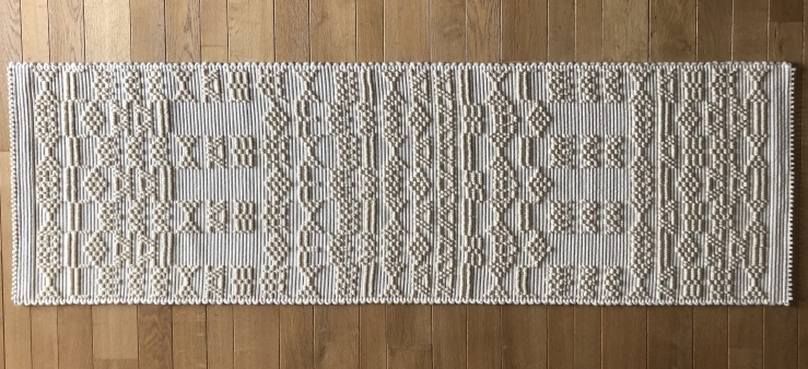
Lavanda di Elvio is a natural line of lavenders, grown organically. Produced in Sinis, a peninsula of powerful beauty in which the sea, the wind and the pristine bells are the treasure chest of the most ancient civilization of Sardinia. Elvio Sulas is an extraordinary character, of encyclopedic curiosity, who knows this land and its history better than the wrinkles on his face. Fascinated by a trip to France, he decided to set up a Lavender field in Sinis. It is a success and the eye-catcher of the flowery field, in June, is a show in the Sinis show. Elvio is passionate about esoteric stories, such as those that tell of the presence of the Templars in those lands. For him I designed a brand that reminds me of the lavender seedling, but is composed of the Flower of Life, a Templar symbol, which mimics the Caduceus of Asclepius of the pharmacopoeia. The result is a very modular brand that lends itself well to use as a pattern. And, remaining on the subject of esotericism, I discovered that one could derive a magic square from some literal elements: SULAS SINIS SALUS – the surname of the family, the place and the Salus of the Latins) literally mean: Sulas is the health of Sinis. And it’s perfectly palindrome. It has been added as a motto to the brand and the logo.
[ Lavanda di Elvio è un una linea naturale di lavande, coltivate con metodi biologici. Prodotti nel Sinis, una penisola di potente bellezza in cui il mare, il vento e le campane incontaminate sono lo scrigno della la civiltà più antica della Sardegna. Elvio Sulas è uno personaggio straordinario, di curiosità enciclopedica, che conosce questa terra e la sua storia meglio delle rughe della sua faccia. Affascinato da un viaggio in Francia, decide di impiantare nel Sinis un campo di Lavanda. È un successo e il colpo d’occhio del campo fiorito, in giugno, è uno spettacolo nello spettacolo del Sinis. Elvio è un appassionato di storie esoteriche, come quelle che raccontano della presenza dei Templari in quelle terre. Per lui ho progettato un marchio che ricorda la piantina della lavanda, ma è composto dal Fiore della Vita, simbolo templare, che mima il Caduceo di Asclepio, simbolo della farmacopea. Il risultato è un marchio molto modulare, che si presta bene all’uso come pattern. E, rimanendo in tema di esoterismo, ho scoperto che si poteva ricavare un quadrato magico da alcuni elementi letterali: SULAS SINIS SALUS – il cognome della famiglia, il luogo e la Salus dei latini) significano letteralmente: Sulas è la salute del Sinis. Ed è perfettamente palindromo. È stato aggiunto come motto al marchio e al logo. ]

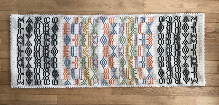
 Here are three new projects for my typographic carpets. One, monochrome, was created, as always by Mariantonia Urru, for Gianni and Alessandra. The second was composed in two different versions, one monochromatic and the other in color, for a family composed of Marco and Laura, the parents, and Daniela and Elisa, their daughters. The larger version is a family rug, divided into three equal bands. I would like that, when Elisa and Daniela will fly from the nest, the carpet can be divided into three narrower bands (although perhaps it could be technically complex), each of which brings with it however all the information of the family, like a DNA.


