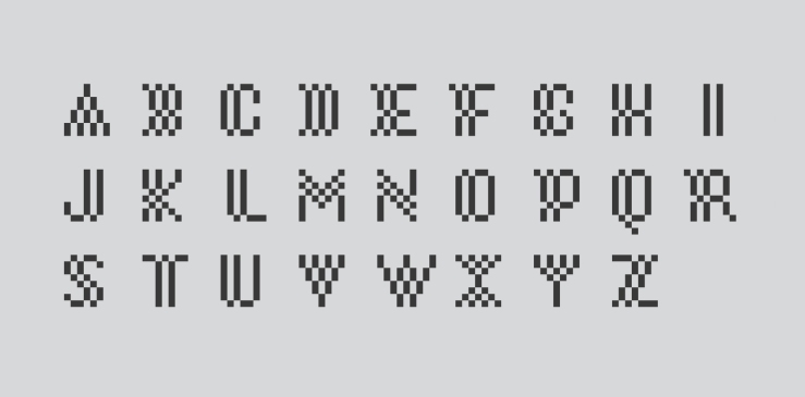
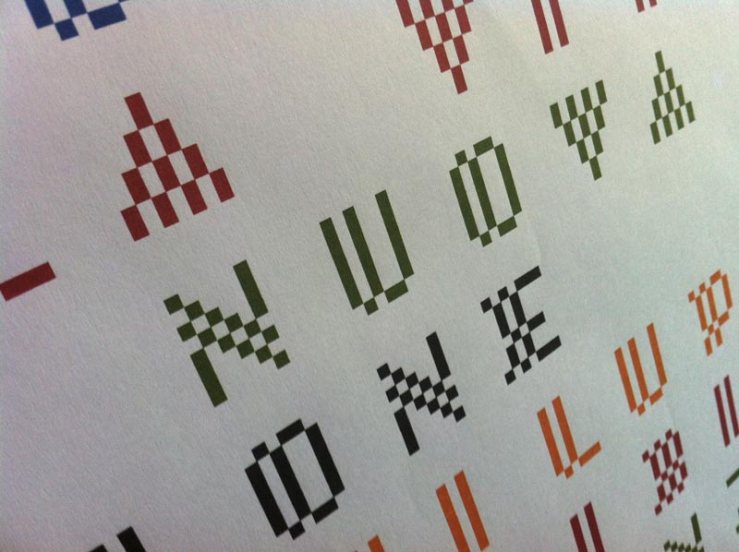
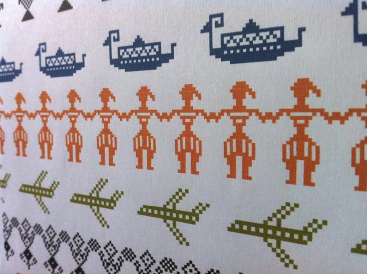
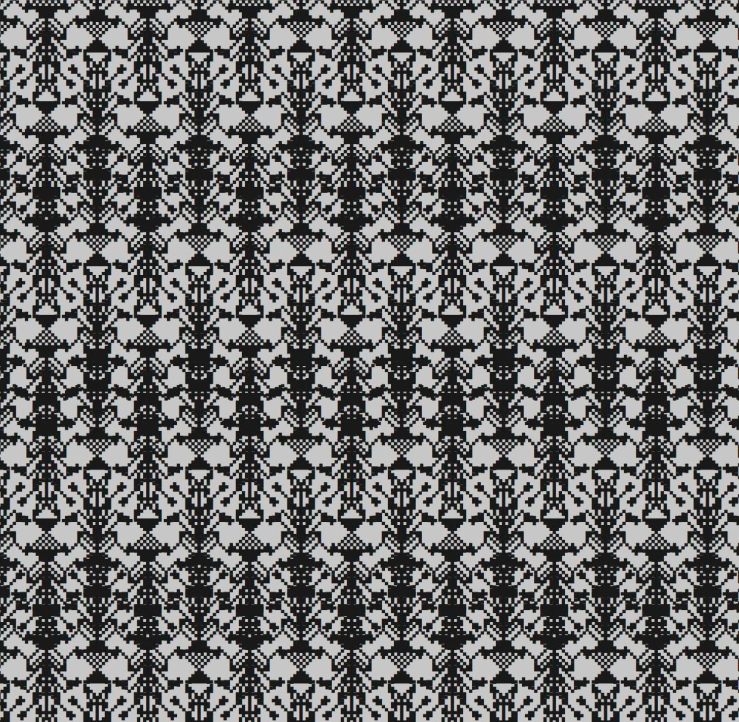
In the summer of 2015, the Autonomous Region of Sardinia asked two groups from the Departments of Architecture of the Universities of Sassari and Cagliari – the first one coordinated by Nicolò Ceccarelli, the second by me – to develop a new visual identity of the island for Expo Milano 2015. This identity will become the visual spine of the communication strategy of Sardinia in the coming years. First I designed a set of typefaces with a strong local identity. I called them Bàttoro (after the name of the traditional weaving from which they take inspiration) and PB1 (as pibione, the Sardinian word for the weaving dot). The equation pixel = pibione established the modular and serial way of the graphic research. The created fonts are decorative, good for headlines and logos or, like you can see, ricursive and intertwining patterns. It’s another way to get interesting typographic textures. Here is shown the claim “Sardegna isola senza fine” (Sardinia endless island), that I created as well. For longer texts, which need to be red without any difficulties, we used the Open Sans. In addition to the first two sets, I wanted a set of dingbats made up of figures of traditional Sardinian weaving, plus some new and imaginative, specifically designed. With my team of collaborators (Matteo Buccoli, Francesca Oggiano, Claudio Rossi), we designed a set of figures called Sardinia Dingbats, with which you can process virtual tapestries typing on the keyboard. The serialization of the compositions follows a way I had already studied for the typographical tapestries and these typefaces give to designers and craftsmen a powerful tool for creating ever new combinations.